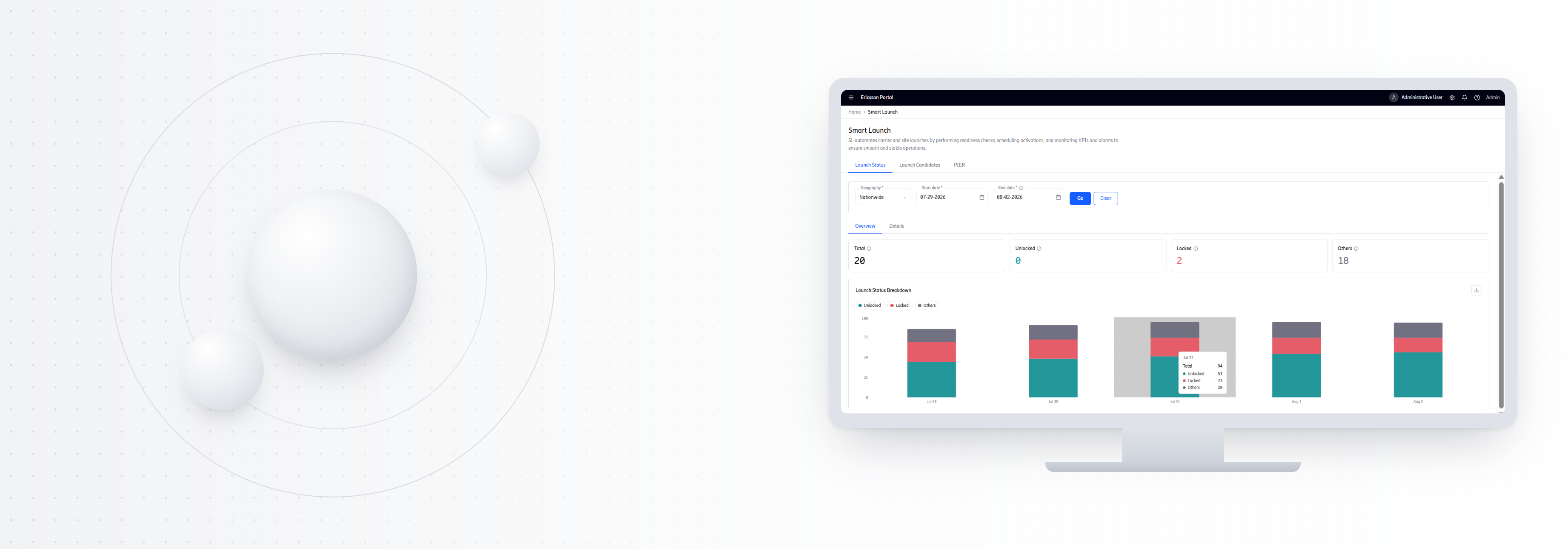
Telecom · RAN automation
The layer the spec left out - Enterprise rApps
This work is under active NDA, so most of the real product visuals aren't shown here: process artefacts and reconstructions stand in for them instead.
The rApps were being shaped through a technically driven discovery process, but there was no structured UX layer connecting technical intent to user workflows causing experience decisions to surface late and creating unavoidable rework across teams.
Key Impact
First User-Validated Prototype
Introduced the first user validation loop to an rApp program that had been running for a year, bringing prototypes to actual users before development.
50%
Faster Delivery
Through a structured UX way of working that brought workflow and experience alignment earlier into discovery.
60%
Reduction in Design Rework
AI-assisted visualization accelerated early exploration and iteration, enabling faster alignment across UX, Product, Discovery, and Engineering.
Ericsson All Stars — Global Recognition: Recognized for customer-centric UX transformation across the rApps portfolio.
01: My Role
What I Owned Across Five rApps
Established a repeatable UX way of working, creating a structured approach that enables designers to take over and continue work with minimal ramp-up.
Led UX strategy and execution across five rApps, introducing a lightweight UX layer between technical requirements and development.
Worked within a server-driven UI model, understanding its predefined components and interaction patterns, and designed intuitive workflows within the technical constraints of the system.
02: The Problem I'm Solving
Identified a missing user-centered layer in how rApps were being built and introduced a lightweight UX practice within an established, highly technical delivery process.
The Existing Ways of Working
Technical Discovery Team
Solution Architects
Engage with Business Stakeholders
Understand needs & validate solutions
HLD / Technical Intent
UX/UI Layer
Translate the designs to design-system-friendly components
rApp 1 Pod
Software Architects
Senior Managers
DevOps
Developers
rApp 2 Pod
Software Architects
Senior Managers
DevOps
Developers
rApp 3 Pod
Software Architects
Senior Managers
DevOps
Developers
rApp 4 Pod
Software Architects
Senior Managers
DevOps
Developers
rApp 5 Pod
Software Architects
Senior Managers
DevOps
Developers
What I Discovered
Before redesigning the rApps, I mapped how work moved from technical discovery to implementation to understand where UX decisions were being made, where handoffs occurred, and where teams were spending effort resolving experience issues.
During an initial walkthrough of the existing interface, I found myself confused about what to do next, which information was primary, and how the navigation hierarchy connected to the task. The system made sense technically, but not experientially — it exposed the underlying system structure without making the user's task progression and information hierarchy immediately legible.
Technical Discovery
3 people
feeding into
5 rApp Pods
Per Pod
8–10 people
Pattern A — UX came in late
Discovery → Development → UX → Changes → Development
Pattern B — UX + Development worked together
Development ↔ UX → Iteration → Development
The Finding
Process
- UX involvement varied across rApps
- Design sometimes began after development was underway
- No consistent UX workflow from HLD → experience → implementation
Product
- Requirements didn't fully translate into user workflows
- Dashboard monitoring behaviours weren't sufficiently defined
- Edge cases and system states surfaced late
- Existing patterns weren't consistently carried forward
Collaboration
- UX and engineering sometimes solved problems together, but often during implementation
- Different teams developed different interpretations of requirements
- Clarifications and changes increased development effort
- Technical documentation didn't capture the experience layer
What I Introduced
HLD + Discovery
Understand the rApp purpose & technical context
User Persona
Understand who is using it
Journey / Workflow
Understand what they need to accomplish
Heuristic Analysis
Identify usability and workflow risks early
Cross-functional Alignment
Create shared understanding before screens or development
Information Architecture + User Flows
Structure the experience around the user's workflow
Wireframes + Prototypes
Make the experience tangible
User Validation
Bring prototypes to actual users before development
Iteration
Feed what we learned back into the process
03: The Project
Ericsson and a major U.S. telecom carrier are developing rApps (Automation Applications) that run on Ericsson’s Intelligent Controller (EIC) to automate and optimize Radio Access Network operations. Each rApp was built around a different network-management purpose and workflow.
Example rApp purposes
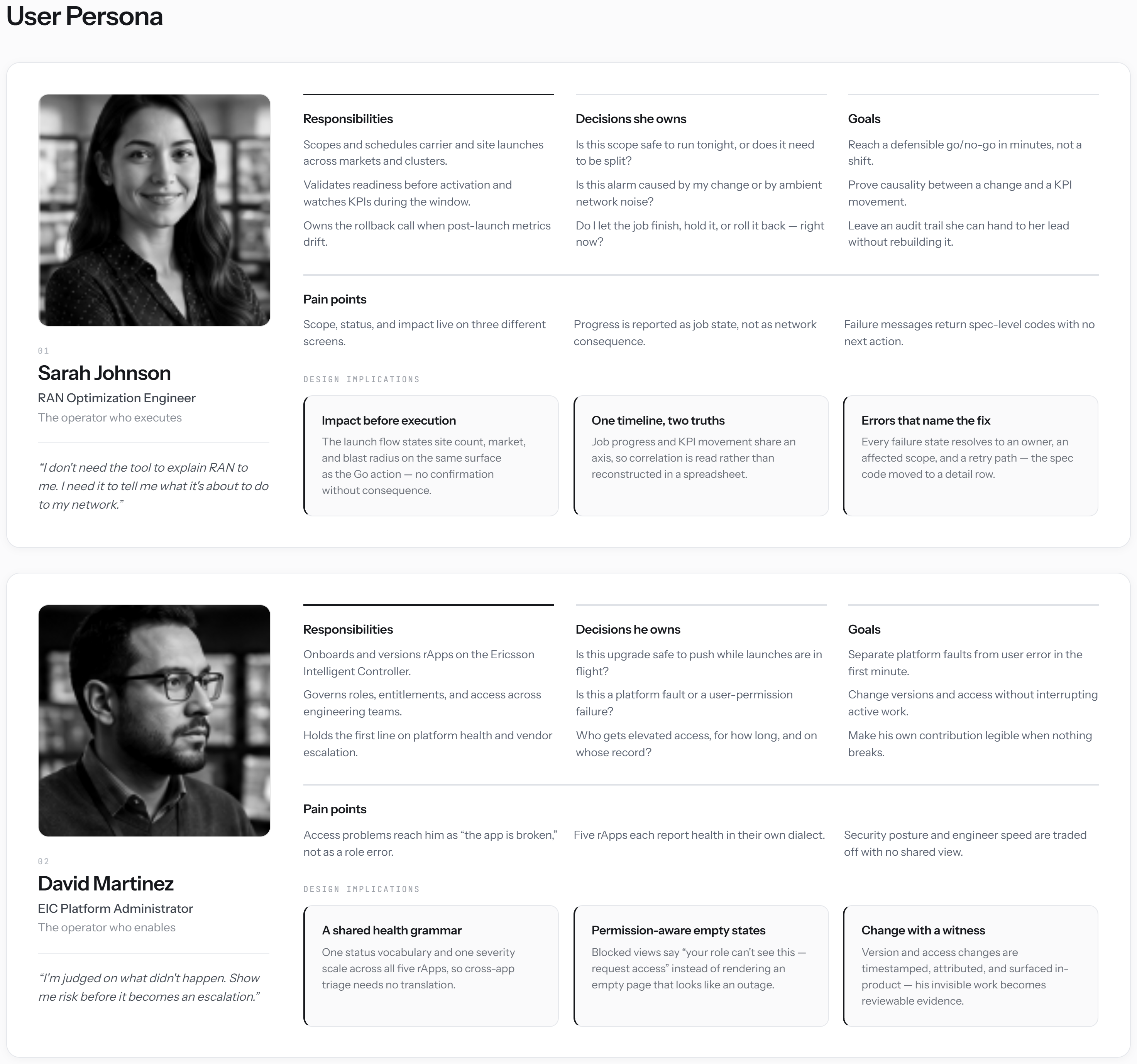
04: Users
Who the document never described
The users were specialists who understood their domain far better than the tool did. The interface's role wasn't to teach the work, but to make the system's state clear. Because every decision affected live operations, confidence mattered more than speed.
05: Journey Map
What the specialist needs to see, at every step
Mapped from the moment a change is proposed to the moment its outcome is confirmed — not what the automation does at each step, but what a specialist making a live-operations decision needs the system to make clear at that exact moment.
| 01 Review | 02 Initiate | 03 Monitor | 04 Deviation | 05 Confirm | |
|---|---|---|---|---|---|
| Specialist goal | Understand the impact | Commit with confidence | Know what is happening | Spot what is going wrong | Know what actually happened |
| Needs | What will change, and what could it affect? | Is this the right action to launch? | Is the system behaving as expected? | What changed from what I expected? | Did the change complete as intended? |
| Existing gap | HLD explains system behaviour, not how to assess the change | The action doesn't clearly signal the point of commitment | Progress doesn't reveal the actual system state | Exceptions aren't clearly surfaced | The final outcome has to be inferred |
| UX response | Translate technical intent into a reviewable plan | Make the launch action explicit | Make system state visible | Surface deviations in meaningful terms | Clearly communicate the final outcome |
06: Heuristic Evaluation
What the legacy screens were already teaching
Before assessing the interfaces themselves, I worked closely with the client's specialists to understand how the existing tools were actually used day to day — where functionality fell short, where workflows broke down, and where legacy patterns were creating friction. Conversations with the discovery team added the technical context behind those gaps, and together they shaped the heuristic assessment below.
A few of the rApps modernised existing applications. I evaluated the legacy interfaces against core UX principles, identifying where hierarchy, navigation, terminology, and interaction patterns created unnecessary complexity. Rather than carrying old patterns forward, the findings informed a simpler, more intuitive experience.
Legacy UX Assessment
| Observation | Finding | Design Response |
|---|---|---|
| Information Hierarchy | Critical actions competed with secondary information, making priorities unclear. | Reorganised content to surface high-priority actions and system status first. |
| Navigation | Multiple navigation paths and entry points created unnecessary complexity. | Simplified navigation and reduced decision points. |
| Content Structure | Related information was scattered across the interface. | Grouped information based on user workflows and tasks. |
| Terminology | System-centric labels and abbreviations increased cognitive load. | Introduced clearer, task-oriented language wherever possible. |
| Workflow | Frequent actions required unnecessary context switching. | Streamlined interactions around the user's primary workflow. |
| System Feedback | Important status and validation cues were difficult to identify. | Improved visibility of system state and action outcomes. |
07: Information Architecture
The structure everyone had to sign
Information Architecture wasn't about navigation, it was about alignment. By defining hierarchy, grouping information, and mapping workflows early, Product Owners, engineers, and stakeholders established a shared understanding of the product before interface design began. Resolving questions at this stage reduced ambiguity and created a stronger foundation for implementation.
Because the existing structure made the next step and information hierarchy difficult to understand, I used the IA to reorganise the experience around the user's workflow rather than simply reproducing the underlying system structure.
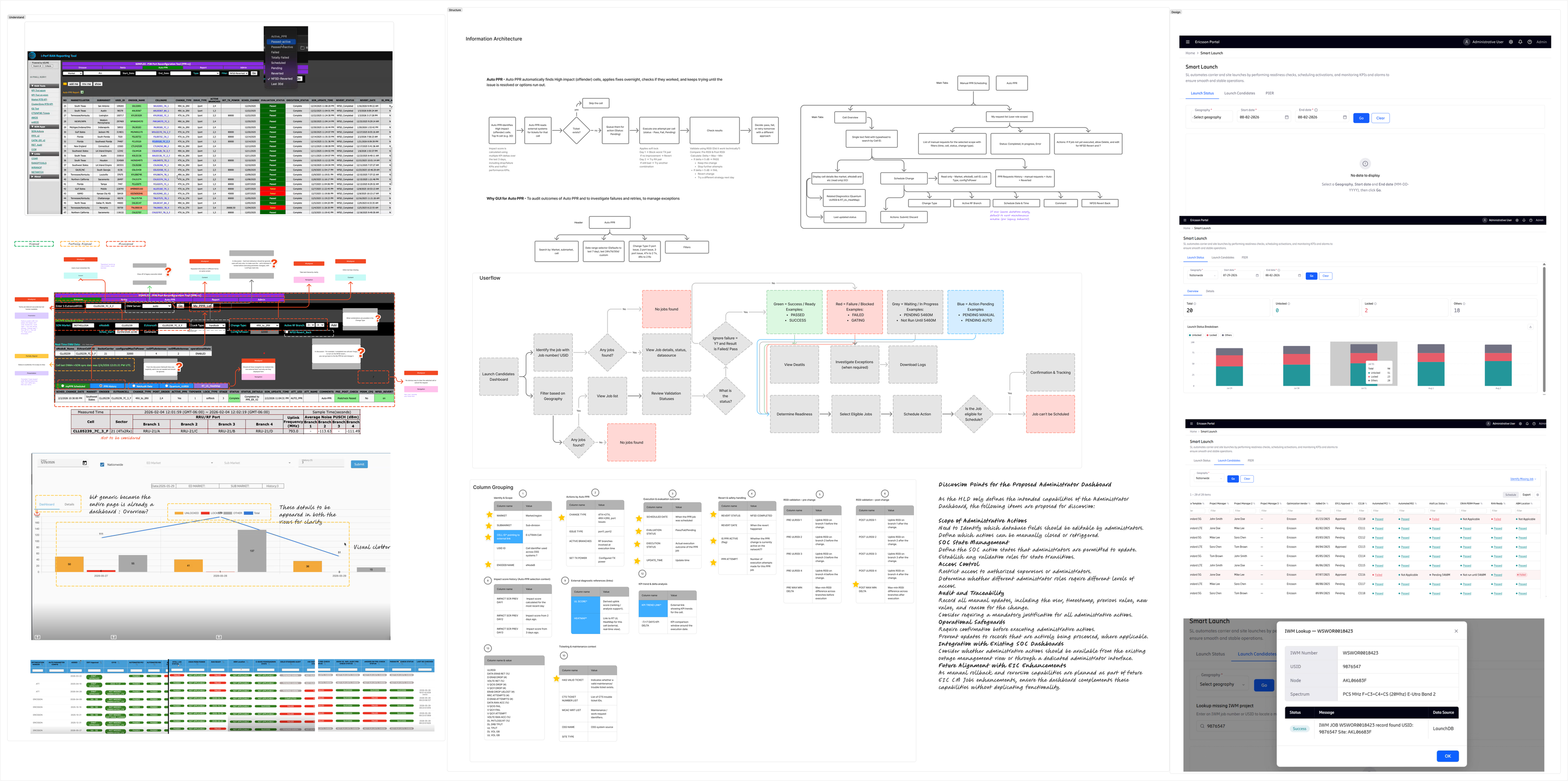
Understanding, structuring, and validating complex workflows before designing the final experience.
08: Wireframes & Iterations
Designing for Operational Reality
Enterprise users rarely follow the happy path. Every prototype was designed to account for loading, empty, error, permission, and exception states, ensuring the experience remained clear and actionable even when things didn't go as planned. Working within the Ericsson Design System kept the focus on behaviour, helping define what users needed to see, understand, and do in every scenario.
| SITE_ID | MKT_CD | CLSTR_ID | REGION_CD | STATUS_FLG | SUB_STATUS | PRIO_LVL | SEV_LVL | OWNR_ID | ASSIGN_GRP | CHG_TYPE | CHG_REQ_ID | APPRV_FLG | APPRV_BY | ESC_LVL | ESC_FLG | CREATE_TS | LAST_UPD_TS | CLOSE_TS | SLA_FLG | SLA_BREACH | VENDOR_CD | VNDR_TCKT | HW_TYPE | HW_VER | SW_VER | FW_VER | CFG_ID | CFG_VER | CELL_ID | SECTOR_ID | BAND_CD | TECH_TYPE | FREQ_MHZ | KPI_FLG | KPI_SCORE | ALRM_CD | ALRM_SEV | ROOT_CAUSE | RESOL_CD | NOTES_FLG | ATTCH_FLG | AUDIT_ID | AUDIT_TS | PERM_LVL | ACCESS_GRP | TICKET_REF | PARENT_ID | CHILD_CNT | LOCKED_FLG |
|---|---|---|---|---|---|---|---|---|---|---|---|---|---|---|---|---|---|---|---|---|---|---|---|---|---|---|---|---|---|---|---|---|---|---|---|---|---|---|---|---|---|---|---|---|---|---|---|---|---|
| N | 114 | SITE-1009 | 2024-05-13 | CLD | N | 156 | SITE-1027 | F6 | ACT | N | 198 | 2024-05-21 | F6 | CLD | N | SITE-1063 | 2024-11-11 | F6 | ACT | 282 | SITE-1081 | 2024-05-01 | F6 | N | 324 | SITE-1099 | 2024-11-19 | ACT | N | 366 | SITE-1117 | F6 | CLD | N | 408 | 2024-11-27 | F6 | ACT | N | ||||||||||
| PND | Y | SITE-1010 | 2024-06-14 | A1 | BLK | Y | SITE-1028 | 2024-12-04 | A1 | PND | 211 | SITE-1046 | 2024-06-22 | A1 | Y | 253 | SITE-1064 | 2024-12-12 | PND | Y | 295 | SITE-1082 | A1 | BLK | Y | 337 | 2024-12-20 | A1 | PND | Y | SITE-1118 | 2024-06-10 | A1 | BLK | 421 | SITE-1136 | 2024-12-28 | A1 | Y | ||||||||||
| CLD | N | 140 | SITE-1011 | B2 | N | 182 | SITE-1029 | 2024-01-05 | CLD | N | 224 | SITE-1047 | B2 | ACT | N | 266 | 2024-01-13 | B2 | CLD | N | SITE-1083 | 2024-07-03 | B2 | ACT | 350 | SITE-1101 | 2024-01-21 | B2 | N | 392 | SITE-1119 | 2024-07-11 | ACT | N | 434 | SITE-1137 | B2 | CLD | N | ||||||||||
| BLK | Y | 153 | SITE-1012 | 2024-08-16 | C3 | PND | Y | 195 | 2024-02-06 | C3 | BLK | Y | SITE-1048 | 2024-08-24 | C3 | PND | 279 | SITE-1066 | 2024-02-14 | C3 | Y | 321 | SITE-1084 | 2024-08-04 | PND | Y | 363 | SITE-1102 | C3 | BLK | Y | 405 | 2024-08-12 | C3 | PND | Y | SITE-1138 | 2024-02-02 | C3 | BLK | |||||||||
| ACT | N | 166 | SITE-1013 | 2024-09-17 | D4 | CLD | 208 | SITE-1031 | 2024-03-07 | D4 | N | 250 | SITE-1049 | 2024-09-25 | CLD | N | 292 | SITE-1067 | D4 | ACT | N | 334 | 2024-09-05 | D4 | CLD | N | SITE-1103 | 2024-03-23 | D4 | ACT | 418 | SITE-1121 | 2024-09-13 | D4 | N | 460 | SITE-1139 | 2024-03-03 | ACT | N | |||||||||
| PND | Y | 179 | SITE-1014 | 2024-10-18 | BLK | Y | 221 | SITE-1032 | E5 | PND | Y | 263 | 2024-10-26 | E5 | BLK | Y | SITE-1068 | 2024-04-16 | E5 | PND | 347 | SITE-1086 | 2024-10-06 | E5 | Y | 389 | SITE-1104 | 2024-04-24 | PND | Y | 431 | SITE-1122 | E5 | BLK | Y | 473 | 2024-04-04 | E5 | PND | Y |
Colour tracks nothing here: clickable and static pills share the same palette, so there's no way to tell which ones do anything without trying each one.
| Site | Market | Status | Priority | Owner | Last Updated | SLA | Ticket | KPI | Access |
|---|---|---|---|---|---|---|---|---|---|
| SITE-4471 | Dallas | Active | P2 | 2 hrs ago | On Track | 96% | Engineer | ||
| SITE-4488 | Austin | Pending | P1 | 15 min ago | At Risk | 88% | Admin | ||
| SITE-4502 | Houston | Blocked | P1 | 1 day ago | Breached | 71% | Viewer | ||
| SITE-4519 | San Antonio | Active | P3 | 4 hrs ago | On Track | 99% | Engineer | ||
| SITE-4533 | Dallas | Closed | P3 | 3 days ago | On Track | 100% | Viewer | ||
| SITE-4547 | Fort Worth | Pending | P2 | 40 min ago | At Risk | 90% | Engineer | ||
| SITE-4561 | Austin | Active | P2 | 6 hrs ago | On Track | 94% | Admin | ||
| SITE-4578 | Houston | Blocked | P1 | 20 min ago | Breached | 65% | Engineer |
Clickables are underlined with a status dot, so there's no guessing. A row with any red dot (an actual failure) gets a light red wash across the whole row.
| Stage | Before | After |
|---|---|---|
| HLD handoff | Given HLD is read by the dev & start the dev | UX team understands the HLD and discusses with discovery and the client |
| User feedback | Arrives after development demo | Arrives early, on low-fidelity prototypes |
| Engineering input | Surfaces at a single handoff meeting | Continuous, throughout the design process |
| Design rework | Concentrated late, no longer needed as dev already done | Caught early, better understanding |
What actually changed, stage by stage: the shift from one late handoff to continuous, early collaboration across all five rApps.
09: Usability Testing
Validating with Users
Interactive prototypes were put in front of the client's users in usability testing sessions, validating workflows, uncovering hidden assumptions, and refining the experience before implementation. Watching how people actually worked through the prototype shaped the product beyond the interface, ensuring it reflected how work was really done.
One interaction changed directly through user feedback: I initially used a modal for additional details. The user preferred to minimise clicks and retain the surrounding context, so I changed the interaction to an inline accordion. This kept the detail accessible without interrupting the user's place in the workflow.
10: Designing at Scale
Designing Five Products, One Process
Designing five enterprise applications within two quarters required more than efficiency, it required a different workflow. I used Figma AI to accelerate the creation of initial EDS-compliant wireframes, freeing time to focus on information architecture, interaction design, stakeholder validation, and edge-case thinking. AI became a production accelerator, while design decisions remained grounded in user needs and collaboration.
Shift 01
Prototype early: show rough work before it's finished
Shift 02
One UX strategy: shared patterns across all 5 rApps
Shift 03
Engineering embedded early: not a single handoff meeting
Result
60% less rework, 50% faster delivery, across 2 quarters
11: Collaboration with Developers
Technical Feasibility & Handover
Working closely with developers through implementation kept design decisions grounded in technical feasibility, with handoff treated as an ongoing conversation rather than a single meeting. When workflow requirements pushed against the system's existing capabilities (server-driven UI), I worked directly with engineering to understand the constraints and find practical solutions within the delivery timeline.
12: Decisions
Decision 01
Structure Before Interface
What was true
The HLD defined system behaviour but never forced alignment on how the product should be structured. Teams agreed on the specification without necessarily sharing the same mental model.
What I chose
I introduced information architecture before any interface design, using it to align Product Owners, engineers, and stakeholders around a shared structure.
What I moved away from
Starting with wireframes. Screens invite feedback on appearance, while information architecture exposes disagreements about workflows and priorities.
What it cost
The first UI appeared later, which occasionally made progress seem slower. But it prevented far more expensive changes during development.
Decision 02
Prototype to Understand
What was true
Direct access to the carrier's users was limited, making every session more valuable for understanding workflows than validating polished interfaces.
What I chose
I used prototypes as conversation starters, encouraging users to explain how they worked, question assumptions, and reveal edge cases.
What I moved away from
Formal task-based usability testing. At this stage, learning how people worked was more valuable than measuring how they completed predefined tasks.
What it cost
The outcome was qualitative rather than quantitative, but it uncovered workflow assumptions that would otherwise have reached development.
Decision 03
A Consistent Design Approach
What was true
Five rApps were delivered in two quarters by a single UX designer. Running five independent design processes wasn't practical.
What I chose
I established a repeatable UX process (analysis, information architecture, prototyping, validation, and engineering collaboration) and applied it consistently across every rApp.
What I moved away from
Creating a different process for every team. While it could have better suited individual products, it would have reduced consistency and made scaling difficult.
What it cost
Not every rApp required every step. Some activities had to be adapted, but the consistent process improved efficiency and collaboration across the programme.
13: Reflection
This project reinforced that the hardest design problems are rarely about interfaces. They are about creating a shared understanding before a single screen is designed. Once that foundation existed, every subsequent product became easier to design, validate, and deliver.
What the Teams Said
“Nithya communicates design decisions with clarity and strong rationale, making it easy for cross-functional teams to understand the 'why' behind each decision. Her documentation consistently transforms complex requirements into clear, actionable direction, enabling alignment and informed decision-making throughout the project.”
“Nithya delivered exceptional UX design and solutioning throughout the project. Her ability to propose practical, user-centred solutions was highly appreciated and well received by the customer.”